A newsletter about vision, taste, and visual ideas.
Steal these Art Direction Techniques: MAD 005
Published 4 months ago • 5 min read
ISSUE 005
The industry is hectic, but the craft remains steady yall.
This week we’re looking at how brand marks can act as a storytelling lens, why a rare phenomenon is the perfect metaphor for the Olympics, and why the most captivating ads are actually the ones that leave the mistakes in.
But first, let's touch on something a bit difficult for me to grapple with...
The Artist vs. The Individual
Ye’s recent sold-out return to SoFi Stadium was a visual masterclass. The stage design featured a massive half-orb that visually transitioned between a rotating Earth and other celestial bodies. I've never seen projection executed at this level. It was an immersive piece of storytelling that proved his ability to create singular spectacles.
Can you separate the spectacle from the creator?
The design for the LA show was undeniably brilliant. However, the artistry sits under the shadow of a history of antisemitic and problematic actions. While he has issued public apologies attributing his behavior to manic episodes and bipolar disorder, the question for the industry remains: can the work be celebrated in isolation? Is his mental health a worth excuse?
Where do you draw the line?
In art direction, we often praise the “visionary,” but this situation serves as a reminder that the person behind the vision cannot be fully detached from the work. We have to weigh the value of creative output against the impact of an artist’s words. For some, the apology is enough to move forward; for others, the creative achievement doesn’t erase the harm caused. I'm personally inspired by the craft, but clearly have not jumped on the band wagon to make viral videos about his performance. Restitution takes time. And I don't know if I'll ever truly believe his intent is pure. We'll see.
The Power of Visual Shorthand
This classic Time Magazine red border campaign is a masterclass in using a brand mark as a lens rather than a badge. By treating a brand asset as a framing device, you create a visual formula that can communicate complex ideas in seconds.
The formula is simple:
Brand mark + Subject
Focus on the underlying story
Use your brand device to isolate a specific detail within a larger scene. Avoid framing the entire image. When you highlight a small piece of a historical moment or a product shot, you signal to the viewer exactly what they should care about. This defines the brand’s perspective by curating the world for the audience.
Maintain logical clarity
Visual shorthand must be airtight to be effective. Simple devices are difficult to execute because they require an immediate connection. If a viewer has to pause to decode the metaphor, the device has failed. Ensure the relationship between the frame and the subject is obvious at a glance.
Balance imagery and copy
The most effective versions of this strategy use copy as a punchline. Let the visual device set the scene while the text delivers the payoff or the emotional hook. In the Google Year in Search ads, the imagery establishes a universal experience while the copy provides the specific narrative depth.
WATCHOUT: Leverage existing associations
This technique relies on iconography carrying a heavy load of meaning. Iconic marks work best because they already live in the viewer’s head. The goal is to trigger a story that the audience finishes for you.
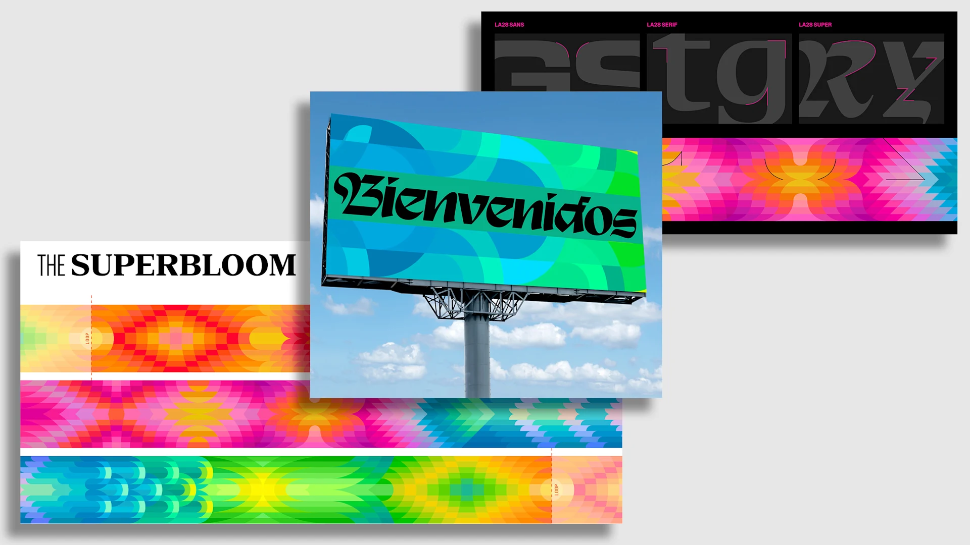
Design Through Metaphor
The LA28 Olympic design identity was recently announced. They're using the “Super Bloom” as a conceptual anchor. This natural phenomenon of dormant seeds exploding into color mirrors the athlete’s journey from years of training to a singular, extraordinary moment on the world stage. Here are some of my takeaways:
Avoiding literal interpretations
A powerful concept often invokes a feeling rather than a literal image. The LA28 work doesn’t rely on flower illustrations; it uses color and patterns to suggest energy and growth. This allows the identity to feel sophisticated and modern while letting the audience’s mind make the connection.
Templates that scale
A successful design concept must be technically versatile and scalable. I can't image how many teams, vendors, and partners are involved in the design of the olympics. By basing the identity on a simple phenomenon, the design team created a system that can lean into more vibrant detailed textures for events or simplify into minimal patterns for merchandise. A strong concept serves as a guide for partners to execute across various channels without losing the core story.
Its hard to please everyone, especially when designing an event, team, or community. Everyone has an opinion. What do you think?
Shipping the Process
The latest OMODA 7 car ads from creative studio Uncommon do something unexpected: they intentionally show what should stay "behind-the-scenes". By showing lighting rigs, air cannons, and cleanup crews in the hero spot, the brand builds a level of trust that a perfectly polished or CGI car commercial cannot reach.
In an era of hyper-polished digital effects, the most impressive part of a stunt is often the reality of how it was made. Instead of hiding the effort behind a “making of” video, bring those glimpses of the practical setup into the final execution. This raw look feels more honest and powerful to a modern audience.
Prove the work to earn belief
Audiences are increasingly skeptical of what they see on screen. If a stunt looks too perfect, people assume it is fake. By refusing to paint out the production equipment or the crew, you provide immediate proof of the work. Shipping the “mistakes” signals that the brand has nothing to hide.
👁️ More to Digest
The Theory of Taste: Developing an insatiable eye requires more than just passive consumption. To build a creative moat, you have to stop scrolling and start digging into the "ingredients" that make up great work. This is just episode 1 of my new series, check it out!
Art Direct Your Home Like a Movie: You don't need a massive rig to get a cinematic look. We're breaking down how to use "practicals", ie the lights existing inside the frame, to treat your personal space like a professional film set.
The Art Director’s Most Underrated Skill: One of the best pieces of advice I ever received from an ECD was about the transition from being a designer to becoming a leader who can articulate and own the room.
1 hour and 20 minutes of Live Q&A
Lastly, you may have missed that I'm gradually bringing back the Friday livestream. Its a fun way to end the week going deep on the best visuals we are seeing and answer questions from the community. Make sure you check out the last stream and subscribe so you don't miss the next one.